I got a mail from WordPress today announcing their AI website building. Having just built a (very basic) theme for WordPress, I decided to take it for a spin.
The first blurb on the entry page is "This is way better than Wix." So we see who their target audience is.
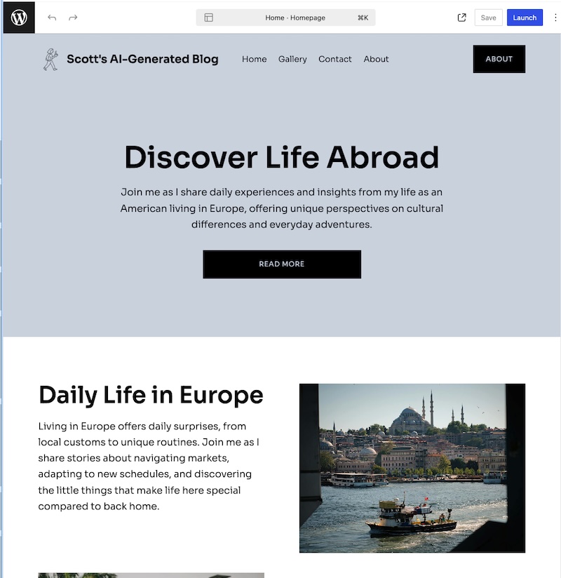
I told the prompt that I wanted a blog to feature my own writing, ranging from tweet-like short posts to a few paragraphs, on daily life and current events from an American living in Europe. It crashed once, but it sent me a mail with a link to resume working on the site.
After it was done with my prompts, it put me in the WordPress Site Editor and asked me to choose fonts, colors, and a basic layout. It won't let me out of the Site Editor until I upgrade to a paid site.
The text is soulless AI, really hung up on Europe. But it looks like a working theme that I could start out with if I were looking to make a site like this. I would give it the Midwestern compliment "it's not too bad".
Just when you think I'm finished with the new post thing, I do one more.
I haven't gone crazy, I just have to test creating a new post, this time with the new feature turned off.
I am now going to test an option, and to do so I will have to make several new posts.
It's always time for a new post!
So here goes this is your new post.
Now I'm going to publish it for the first time and see what happens!
Questions about where we're at and how this will work going forward..
- When will it become time to install this on daveverse? assuming that will have to wait until baseline theme is available on wordpress.com.
- The home page is awkward mix of titled and titleless posts. Have to think about this. We've handled titleless ok on the story page. The home page is basically a timeline. Prior art in many places. Scripting News home page for example, though it breaks things down into days, not really good here. Also the Timeline that's now in WordLand does this for titled and untitled posts, as does the FeedLand timeline. Using it will help answer.
- I got from previous answers that it will not be possible for a WordLand user to add CSS at either the story or site level. Next question, Scott, looking at the built page in the debugger, it appears as if my CSS file is included more or less as-is, ie makes it all the way back to my browser! So it looks like you should be able to just incorporate my changes somehow, without having to enter each by hand.
- I will have some tweaks to the CSS later today.
- On the story page — when a post doesn't have a title, make the byline (time and author) be in the style of the title. This might be the answer for the awkwardness of the home page (see above).
- <title> in the head section of each of the page needs work. The home page should be the title of the blog, and each story page the title should be the title of the post.
I did a survey of news sites and blogs to see how they show their titles
- Gothamist puts the name in the upper left corner, leaving room for some buttons and a menu in the right corner.
- Ars Technica does something similar, name of site in upper left corner, with an array of buttons flush right.
- Empty Wheel does the same thing. (I sense a pattern here.)
- Missouri Independent centers the title in much bigger type than the previous examples, the buttons are arrayed above it (more buttons).
- EV Grieve puts the name in the upper left corner without much fanfare. Proves that it doesn't have to be eye-catching, it's the attitude and the content I love. One of my longtime favorites. It's an East Village neighborhood blog, running in Blogger for ages.
- Seth's Blog is a WordPress site, managed by Automattic. The left sidebar includes the title of the blog, and has a list of things he wants you to read, and how to get on his mail list, etc. So effectively the title is in the upper left corner, and the equiv of the buttons are arrayed vertically in a column. The functionality of his blog is probably closest to what I have in mind for WordLand, but into spartan beginnings. It's easy to add stuff, impossible to take away.
- Simon Willison's Weblog, another great example of the kind of writing I want people to do with WordLand. He puts the title in the upper left corner, with a single button flush right. He deals with the recent articles thing by putting a list of three posts, linkblog style, at the bottom. I like this placement, btw. Positioned as an afterthought. If you're lingering here, you might like this? I pretty much always ignore this kind of stuff.
- Manton Reece does the same thing everyone else is doing. Title at the top left, an array of buttons flush-right at the same level. What's uncommon about his style is that the name of his blog is tiny, 13px. But it also is very visible.
- Kottke does not include the title of his blog on a story page. This is remarkable. But he does have the author name very prominently placed, it's the very topmost text on the page, impossible to miss. So amazingly the title is visible, even though it isn't there.
- Pluralistic puts the title in big type flush left, with a subtitle, and the buttons are below the title, before the headline of the post (lots of white space separating).
WordLand does The Right Thing with title-less posts.
This is one of those posts.
Let's see what it does with it!
😄
This is a test post as a user with role "author" with a their own WordPress.com account.
This is posted with WordLand on my brand new self-hosted WordPress site!